Software Engineer Job Postings Are Rising. Here Is What I See on My Board That the Chart Does Not Show.
📧 Subscribe to JavaScript Insights
Get the latest JavaScript tutorials, career tips, and industry insights delivered to your inbox weekly.
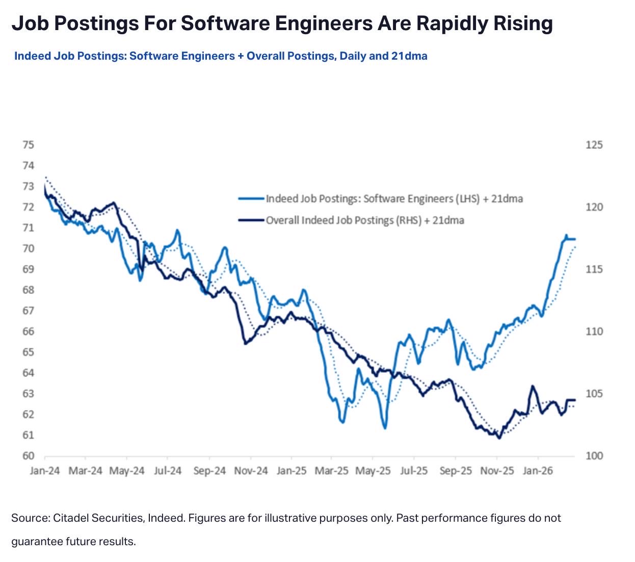
Last week a chart from Indeed and Citadel Securities started moving through my LinkedIn feed. Software engineer job postings rising sharply after a year of decline. Career coaches reposted it with optimism. The market is back, they wrote.
I opened the comments. Forty one of them by the time I looked. Almost none of them celebrated.
The first response was a backend developer asking how many of those postings actually lead to hires. The second was a software engineer pointing out that the chart said nothing about which seniority levels were rising. The third was a developer with twenty six years of experience saying thirty companies had recently interviewed her and told her she did not qualify as senior.
That gap between the chart and the comments is the entire story.
I curate JavaScript and frontend jobs on jsgurujobs.com. I read roughly two hundred postings every week. Here is what I see on my board that this chart does not show, and what the rising line actually means for a JavaScript developer looking for work in 2026.
The Chart Everyone Is Sharing and the Comments Nobody Is Reading
The chart shows two lines from Indeed data, normalized against January 2024. One line tracks software engineer postings specifically. The other tracks overall job postings on Indeed. Both lines declined through most of 2024 and 2025. Both lines started turning up in late 2025. The software engineer line is rising faster.
That is the chart. That is what people are celebrating.
The celebration is built on one assumption. More postings equal more hiring. That assumption is doing a lot of work in those LinkedIn captions and it is not obviously true.
I started reading the comment threads under three different versions of the chart on LinkedIn this week. The pattern was the same in all three. Career coaches and content creators reposting with optimism. Practicing developers responding with detailed objections. Almost nobody in the middle.
The objections kept coming back to the same three points. The chart counts postings, not hires. The chart does not separate seniority. The chart treats title inflation as if it does not exist. I will take each of those in turn, because all three match what I see when I sort and read the jobs I curate every week.
If the chart was a clear signal of recovery, the developer comments would look different. They do not. They look like people who have been looking for work for months and feel actively misled by a metric being used to describe their situation.
The Graph Counts Postings, Not Hires
The most cited objection under the viral chart was about ghost listings. The argument goes that companies post jobs without intending to hire, or with intentions that never get budgeted, and those postings inflate the count without ever leading to anyone getting employed.
I cannot prove ghost listings at scale from my position. I do not have a hire tracking pipeline that follows up with every company after a candidate applies. What I can say is that I see something adjacent to ghost listings every week on my submission queue.
Companies submit jobs that look real on first read. Then I check the company career page directly. The role is not listed there. Or the role is listed but was first posted six months ago and is still up. Or the role has a slightly different title with slightly different requirements. Or the company has eight open frontend roles listed, but a LinkedIn search for current employees shows the frontend team is three people and has been three people for a year.
Those are signals of something. Maybe not pure ghost listings the way some commenters described them. Maybe slow hiring. Maybe approval delays. Maybe ego postings to look like the company is growing. Whatever it is, the public job count does not match the actual hiring rate. The volume of jobs visible to applicants on aggregators like Indeed is a much weaker proxy for hiring activity than it used to be.
I wrote about this pattern in detail earlier in Why Companies Post JavaScript Jobs They Never Fill and How I Spot Ghost Listings on My Board. The short version is that posting a job costs almost nothing now. Filling a job costs a lot. Companies have economic incentive to do the first whether or not they ever do the second.
The Indeed chart cannot tell the difference. So when the line goes up, the line going up tells you that more jobs exist on Indeed. It does not tell you whether more people are getting hired. Those two numbers used to be correlated. In 2026 they are not.
The Chart Treats All Engineers the Same
The second objection under the viral chart was that it does not separate seniority. A Senior Staff Engineer role at a fintech and a Junior React Developer role at a small startup count as one job posting each. The chart treats them as equally meaningful.
But they are not equally meaningful.
When I sort the postings on my board by seniority signal, something becomes obvious. Senior and Staff dominate. Junior roles are a rarity. Mid level roles exist but are often labeled "senior" and require the candidate to ship independently from day one with minimal ramp.
This is not a quirk of which jobs I choose to approve. I curate from across the full submission queue and from companies hiring directly. The mix is what it is. The mix is heavily weighted toward senior and above, and the gap has been widening for months.
This pattern shows up in compensation too. The senior roles on my board often disclose competitive salaries. The junior roles, when they exist at all, usually do not disclose salary and when you check the company indirectly the offered range turns out to be modest. The market did not just shift toward senior. It shifted toward better compensated senior while leaving early career roles relatively poorly paid where they exist at all.
If you are a senior engineer with strong references and a verifiable track record of shipped products, the chart is real for you. The market did come back, for you specifically. The rising line on the chart corresponds to actual offers landing in your inbox.
If you are a junior or mid level engineer, the chart is showing someone else's recovery. Your slice of the market did not move much. Pretending it did is a small cruelty.
I covered this pattern from a different angle in The Quiet Death of the Junior JavaScript Developer Role. The data has not changed since I wrote that. If anything the gap between senior demand and junior demand has gotten wider, not narrower.
The Bar Rose Faster Than the Title
The third objection under the viral chart was the most personally painful for the people leaving it. Eva Raimundez left a comment saying she has twenty six years of experience and thirty companies recently told her she did not count as senior.
I see the other side of this on my board every week.
Job postings titled "Junior Frontend Developer" that ask for three years of production React experience, comfort with TypeScript, ability to work with REST APIs and at least basic familiarity with Node.js. That is not a junior role. That is a mid level role with a junior salary attached.
Postings titled "Senior" require what used to be Staff level work. Architecture decisions, cross team coordination, mentorship of less experienced engineers, plus the actual frontend work. Postings titled "Staff" require what used to be Principal level work. Strategic technical direction, multi quarter planning, hiring input, plus deep technical contribution.
The titles inflated. The requirements inflated. The salaries did not inflate the same way. And somehow Eva, with twenty six years of experience, does not count as senior at thirty companies.
This is what title inflation looks like from inside the hiring system. Companies want the work of a more experienced engineer without paying for the title that work used to come with. They also want the candidate filter that comes from advertising at a lower title, because lower titles attract more applicants which lets the company pretend their hiring funnel is healthy.
The Indeed chart does not see this. It sees a Junior Frontend Developer posting and counts it as one job. It does not know that the role requires three years of experience and is therefore not actually a junior role. It does not know that companies are posting Senior roles that filter out experienced engineers because they do not match the increasingly narrow definition of "senior" that hiring managers now use.
If you map the chart against the real seniority shift, the recovery becomes a different story. There are not more jobs available to most developers. There are more jobs available to a specific kind of developer who matches a specific narrowed definition of what companies want to hire right now. The rest of the market got reshaped around them.
What I Think the Chart Is Actually Showing
Here is what I think the chart is actually showing.
Not a recovery. A consolidation.
Companies are posting more jobs because they have a clearer idea of what they want now than they did two years ago. They want experienced engineers who can integrate AI tools into their workflow without training, ship features end to end without management overhead, and contribute to architecture decisions from week one. They want this engineer to already exist, fully formed, ready to join their stack. They do not want to grow this engineer internally because that costs time and money and the company has neither.
What they do not want is the developer who needs ramp up time. The developer who pushes back on AI tooling. The developer who insists on the old way of doing things. The developer who treats every code review as a debate. The developer who needs a mentor before becoming productive. The market did not return to 2021. The market figured out what it actually wanted, and that thing is narrower than what most developers offer.
For a junior developer looking at this chart, the recovery line is misleading. Their slice of the market did not move. For a mid level developer without strong AI workflow experience, the recovery line is also misleading. Their slice moved sideways at best. For a senior developer with a portfolio of shipped products, demonstrable AI integration experience, and the kind of references that get checked, the line is real and the offers are coming.
I do not love this conclusion. I write a newsletter for JavaScript developers. Many of them are early career or mid career. The chart everyone is sharing is not their chart. Pretending it is, like the optimistic LinkedIn posts are doing, does them no favors. It tells them to apply more, to send more resumes into the void, to interpret rejection as bad timing instead of structural mismatch.
That advice is bad. The mismatch is structural. The fix is also structural, and it has very little to do with the chart going up.
The fix is to look at what the surviving roles actually want and decide whether you can credibly position yourself for them. Senior, AI fluent, ships independently, integrates without ramp. If those four things describe you, the chart is your chart. If they do not, the chart is a chart about other people and the work is to become the person the chart is about.
I covered the underlying skill question in The AI Augmented JavaScript Developer and How to 10x Your Output Without Losing the Skills That Keep You Employed. That article is about the habits. This one is about the chart. The two go together.
What This Means If You Are Actually Looking for Work
If you are senior with shipped products and you have not been getting calls, the chart is telling you something useful. The market is moving. The fact that you are not being called means your positioning needs work, not that demand is absent. Sharpen your resume around shipped outcomes, not skills lists. Get specific about AI workflow integration in your CV in concrete terms. Update your LinkedIn around what you have actually built and shipped recently, not your stack list.
If you are mid level, the chart is mostly not about you. Apply to senior roles where you can credibly stretch into the responsibilities, even if your current title says mid. The label matters less than the actual scope of work you can describe with confidence. Many mid level engineers shipping real production work in 2026 are doing senior level work without the title. Apply accordingly.
If you are junior or transitioning, the chart is not a signal that things got easier for you. It is a signal that things got harder, because companies that might have hired juniors a few years ago are now hiring seniors with AI integration experience instead. The gap is real and the chart hides it. Your strategy has to assume the gap exists, not assume the chart applies.
The advice that does not change for any of these groups is to stop applying to listings on aggregators without verifying the company is actually hiring. The ghost listing problem inflates apparent demand. Spend your application energy on companies you have verified through their own career page, through LinkedIn employee growth signals, through other developers who actually got responses recently. The aggregator listings are noisy. The signal lives elsewhere.
A Note on Why This Chart Is Going Viral Now
Charts go viral when the people sharing them have a story to tell. The story being told about this chart is recovery. Recovery sells engagement. Recovery sells courses and resume reviews and interview prep services. Recovery sells optimism, and there is a small economy of LinkedIn content creators who profit when developers feel hopeful and search for ways to act on that hope.
The chart is a useful artifact for that economy. The actual underlying data is more complicated and less suitable for confident narratives. Most things in hiring markets are.
The developers leaving angry comments under the optimistic posts are not wrong. They are reading the same chart through their own experience of the market. Their experience is real. The chart is also real. Both can be true at the same time. The chart shows what it measures, which is posting volume on Indeed. It does not show what most people want it to show, which is the actual employment situation for software engineers in 2026.
If you want a clearer signal than the chart, stop looking at aggregator metrics. Look at what your specific peers are saying happened in their last three job searches. Look at how long it takes to get from application to offer in your specific stack and seniority level. Look at how many of the offers are matching what you used to make, versus pay cuts dressed up as opportunities. That is the data that tells you whether the market actually came back for you.
The chart cannot tell you that. The viral version of the chart, with the optimistic captions, definitely cannot tell you that.
Closing
A chart on its own is data. A chart in context is narrative. The narrative most people are pushing right now is that the market is back because that narrative gets engagement and sells optimism.
The real narrative is more useful and less viral. The market selected for a specific kind of engineer in 2026. That engineer is senior, AI fluent, ships independently, integrates into existing teams without ramp up, and does not waste hiring manager time. If that describes you, you have more offers right now than you have had in three years.
If that does not describe you, the rising line on the Indeed chart is not for you. The recovery is real, but it is selective. The developers most affected by the layoffs of 2024 and 2025 are the same developers least helped by the supposed recovery of 2026.
I read postings every week and I talk to developers who message me from my newsletter. The gap between the chart everyone is celebrating and the inboxes of mid level developers is one of the widest I have seen since I started doing this.
Next time you see the chart, scroll past the celebration and read the comments. The truth is there.
If you want more observations from inside the JavaScript job market in 2026, I publish weekly at jsgurujobs.com. The newsletter is free and the observations come from the same job postings I have been reading every week for the past fourteen months. You can also find more pattern recognition in What I Keep Seeing in JavaScript Job Postings After Running a Job Board for 14 Months if this is the kind of analysis that helps you.
FAQ
Is the software engineer job market actually recovering in 2026?
The Indeed chart shows posting volume rising, which is real. Whether posting volume corresponds to actual hiring is a different question. Based on what I see on my board and what developers report from their job searches, the recovery is selective. Senior engineers with AI integration experience and shipped products are getting more offers. Junior and mid level developers without that profile are seeing little change in their actual response rates.
Why are companies posting so many software engineer jobs if they are not hiring?
Several reasons. Posting a job costs almost nothing while filling one costs a lot. Open postings make companies look like they are growing, which matters for investor optics and employee morale. Some postings have been open for months without active recruiting because the budget has not been approved. Some are for roles that exist on paper but where hiring has been paused. The volume of postings has become a weaker signal of actual hiring activity than it used to be.
What kind of JavaScript developer is actually getting hired in 2026?
From what I see on my board, the consistent pattern is senior or staff level engineers who can ship features end to end, integrate AI tools into their daily workflow without training, and join an existing team with minimal ramp up time. Architectural fluency, cross stack capability, and a portfolio of shipped products matter more than specific framework expertise. The narrowing is not about which technology you know. It is about how independently you can produce results.
Share this article