Web Accessibility for JavaScript Developers in 2026 and Why a11y Is Now a Legal Requirement That Affects Your Job
📧 Subscribe to JavaScript Insights
Get the latest JavaScript tutorials, career tips, and industry insights delivered to your inbox weekly.
The European Accessibility Act took effect on June 28, 2025. Every digital product sold or used in the European Union must now meet WCAG 2.1 AA standards or face fines. The United States saw a record 4,605 web accessibility lawsuits filed in 2024, up 14% from the year before. Target paid $6 million. Domino's went to the Supreme Court and lost. Winn-Dixie settled for over $100,000 in legal fees alone. In 2026, accessibility is not a nice-to-have feature that your company might prioritize someday. It is a legal requirement that affects every JavaScript application serving users in the EU or the US.
I track JavaScript job postings on jsgurujobs.com daily, and accessibility requirements have increased dramatically. In 2024, roughly 8% of JavaScript job postings mentioned accessibility, a11y, or WCAG. In 2026, that number is 22%, and the trend is accelerating quarter over quarter. For senior roles at companies with European customers, it exceeds 40%. The demand for developers who understand accessibility is growing faster than the supply of developers who actually have these skills, which means this knowledge commands a salary premium of 10-15% over equivalent roles without accessibility requirements.
Most JavaScript developers treat accessibility as an afterthought. They build the feature, ship it, and maybe add some aria labels if someone complains. This approach was tolerable when accessibility was a best practice. Now that it is law, the developer who understands accessibility from the first line of code is the developer companies cannot afford to lose.
Why Web Accessibility Became a Legal Requirement and What It Means for JavaScript Developers
The European Accessibility Act is the biggest regulatory change to affect web development since GDPR. It applies to every company that offers products or services in the EU, regardless of where the company is headquartered. If your React application is accessible to EU users, it must comply. The penalties vary by member state but include fines, forced compliance orders, and in some cases, blocking the product from the EU market entirely.
In the United States, the ADA (Americans with Disabilities Act) has been interpreted by courts to apply to websites since 2019. There is no explicit federal web accessibility law, but the case law is clear and the number of lawsuits is accelerating. Companies with annual revenue above $50 million are the primary targets, but smaller companies are increasingly being sued as well.
For JavaScript developers, this means accessibility is no longer a specialty skill. It is a baseline requirement, like security or performance. You would not ship an application without HTTPS. In 2026, you should not ship an application without keyboard navigation, screen reader support, and proper color contrast. The companies that build production applications that users actually want to use are the ones that understand accessibility is part of the user experience, not an obstacle to it.
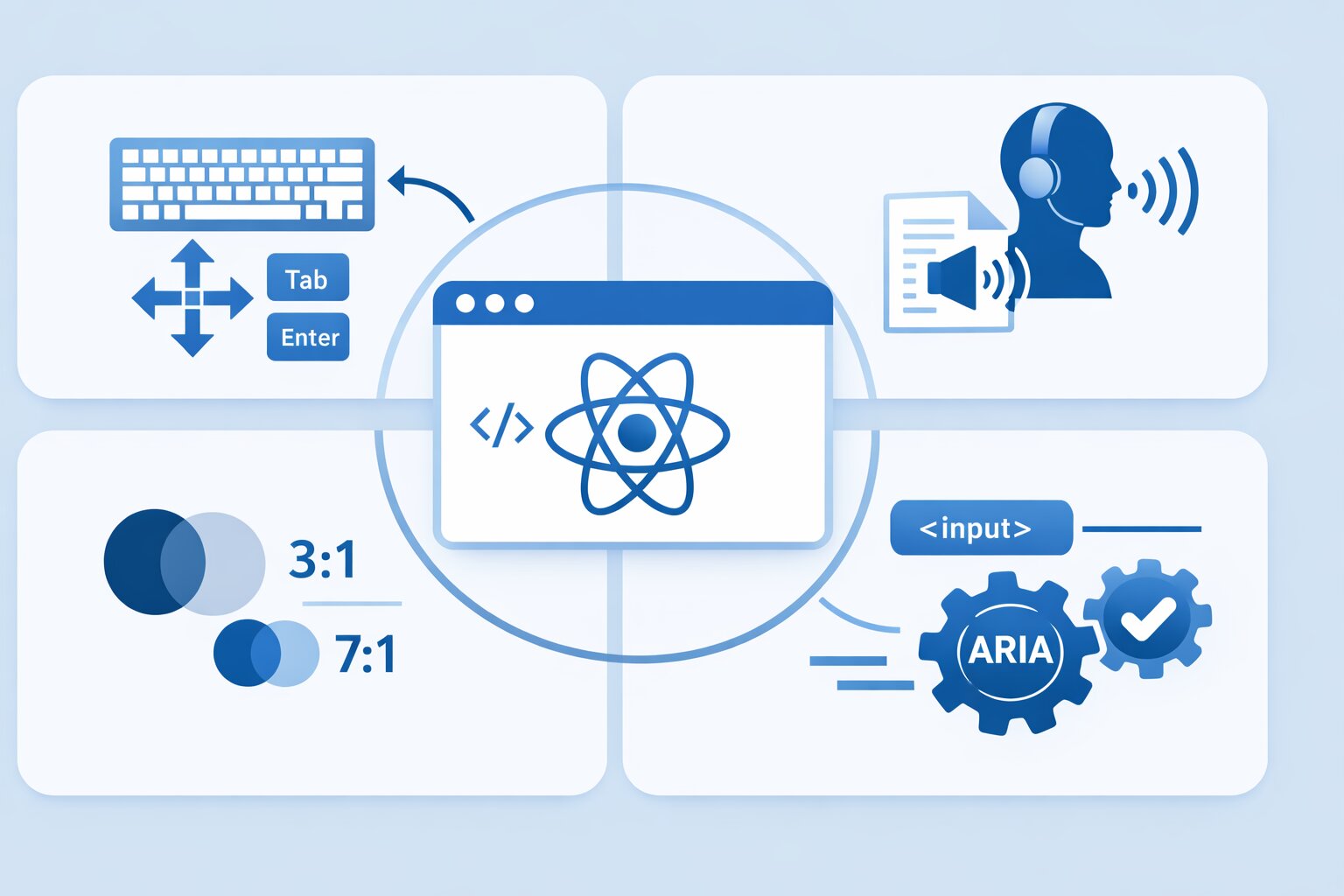
WCAG 2.1 AA Standards That Every JavaScript Developer Must Know
WCAG (Web Content Accessibility Guidelines) is the standard that defines what "accessible" means. Level AA is what most laws require. It is not as extreme as Level AAA (which is aspirational) but it is significantly more demanding than what most JavaScript applications currently implement.
Perceivable Content Requirements
All content must be perceivable by all users, including those who cannot see the screen. This means every image needs alternative text that describes its content, not just alt="image" but alt="Bar chart showing React job postings increasing 23% from January to March 2026". Every video needs captions. Every form field needs a visible label.
For React developers, the most common violation is using placeholder text as the only label for form inputs. Placeholders disappear when the user starts typing, leaving no indication of what the field is for. Screen readers may or may not read placeholder text depending on the implementation.
// BAD - placeholder as the only label
function SearchBar() {
    return (
        <input
            type="text"
            placeholder="Search jobs..."
        />
    );
}

// GOOD - visible label with proper association
function SearchBar() {
    return (
        <div>
            <label htmlFor="job-search" className="sr-only">
                Search jobs
            </label>
            <input
                id="job-search"
                type="text"
                placeholder="Search jobs..."
                aria-label="Search jobs by title, company, or technology"
            />
        </div>
    );
}
The sr-only class (screen-reader only) hides the label visually but keeps it available for assistive technology. This is a common pattern in modern JavaScript applications where the visual design does not include visible labels but accessibility requires them.
Operable Interface Requirements
Every interactive element must be operable with a keyboard alone. No mouse required. This is the requirement that breaks the most JavaScript applications because developers build custom components (dropdowns, modals, tabs, date pickers) that work perfectly with a mouse and are completely unusable with a keyboard.
The test is simple: can you use your entire application using only the Tab key, Enter key, Escape key, and arrow keys? If any feature requires a mouse click, hover, or drag operation without a keyboard alternative, your application fails WCAG AA compliance.
// BAD - custom dropdown only works with mouse
function Dropdown({ options, onSelect }: DropdownProps) {
    const [isOpen, setIsOpen] = useState(false);

    return (
        <div onClick={() => setIsOpen(!isOpen)}>
            <span>Select option</span>
            {isOpen && (
                <div>
                    {options.map(option => (
                        <div key={option.value} onClick={() => onSelect(option)}>
                            {option.label}
                        </div>
                    ))}
                </div>
            )}
        </div>
    );
}

// GOOD - accessible dropdown with keyboard support
function Dropdown({ options, onSelect }: DropdownProps) {
    const [isOpen, setIsOpen] = useState(false);
    const [activeIndex, setActiveIndex] = useState(-1);
    const listRef = useRef<HTMLUListElement>(null);

    function handleKeyDown(e: React.KeyboardEvent) {
        switch (e.key) {
            case 'Enter':
            case ' ':
                e.preventDefault();
                if (isOpen && activeIndex >= 0) {
                    onSelect(options[activeIndex]);
                    setIsOpen(false);
                } else {
                    setIsOpen(true);
                }
                break;
            case 'Escape':
                setIsOpen(false);
                break;
            case 'ArrowDown':
                e.preventDefault();
                if (!isOpen) setIsOpen(true);
                setActiveIndex(prev =>
                    Math.min(prev + 1, options.length - 1)
                );
                break;
            case 'ArrowUp':
                e.preventDefault();
                setActiveIndex(prev => Math.max(prev - 1, 0));
                break;
        }
    }

    return (
        <div onKeyDown={handleKeyDown}>
            <button
                aria-haspopup="listbox"
                aria-expanded={isOpen}
                aria-label="Select option"
                onClick={() => setIsOpen(!isOpen)}
            >
                {activeIndex >= 0 ? options[activeIndex].label : 'Select option'}
            </button>
            {isOpen && (
                <ul
                    ref={listRef}
                    role="listbox"
                    aria-label="Options"
                >
                    {options.map((option, index) => (
                        <li
                            key={option.value}
                            role="option"
                            aria-selected={index === activeIndex}
                            className={index === activeIndex ? 'bg-blue-100' : ''}
                            onClick={() => {
                                onSelect(option);
                                setIsOpen(false);
                            }}
                        >
                            {option.label}
                        </li>
                    ))}
                </ul>
            )}
        </div>
    );
}
The accessible version is longer, but it works for everyone. Keyboard users navigate with arrow keys. Screen reader users hear "Select option, listbox, expanded" and can navigate through options. Mouse users experience no difference. This is the pattern that companies expect senior developers to implement by default, not as a retrofit.
Color Contrast Requirements
Text must have a contrast ratio of at least 4.5:1 against its background (3:1 for large text). This is the easiest requirement to meet and the most commonly violated. Light gray text on a white background looks elegant to designers but is unreadable for users with low vision. And it fails WCAG AA.
/* BAD - contrast ratio 2.5:1 (fails AA) */
.text-subtle {
    color: #999999;
    background: #ffffff;
}

/* GOOD - contrast ratio 4.6:1 (passes AA) */
.text-subtle {
    color: #767676;
    background: #ffffff;
}

/* GOOD - contrast ratio 7:1 (passes AAA) */
.text-subtle {
    color: #595959;
    background: #ffffff;
}
Use the Chrome DevTools accessibility inspector or the WebAIM contrast checker to verify your color combinations before shipping. Both are free and take seconds to use. Tailwind CSS developers can use the text-gray-600 class on white backgrounds (contrast ratio 5.0:1, passes AA) but should avoid text-gray-400 (contrast ratio 3.0:1, fails AA for normal text). The difference between these two classes is the difference between legal compliance and a potential lawsuit.
Building Accessible React Components in 2026
React is the most popular JavaScript framework, and it has specific patterns and pitfalls for accessibility. Understanding these patterns is what interviewers test when they ask about a11y in React interviews.
Focus Management in Single Page Applications
The most common accessibility failure in React applications is broken focus management during navigation. When a user clicks a link in a traditional website, the browser navigates to a new page and focus resets to the top. In a React SPA, the URL changes but the page does not reload. Focus stays wherever it was, which means a screen reader user has no idea that the page content changed.
// Focus management hook for React Router
import { useEffect, useRef } from 'react';
import { useLocation } from 'react-router-dom';

export function useRouteAnnouncer() {
    const location = useLocation();
    const announcerRef = useRef<HTMLDivElement>(null);

    useEffect(() => {
        const pageTitle = document.title;

        if (announcerRef.current) {
            announcerRef.current.textContent = `Navigated to ${pageTitle}`;
        }

        // Move focus to the main content area
        const mainContent = document.getElementById('main-content');
        if (mainContent) {
            mainContent.focus();
        }
    }, [location.pathname]);

    return (
        <div
            ref={announcerRef}
            role="status"
            aria-live="polite"
            aria-atomic="true"
            className="sr-only"
        />
    );
}
The aria-live="polite" region announces navigation changes to screen readers. The focus move to #main-content ensures keyboard users start at the top of the new page content. Without this, a keyboard user who navigates from the homepage to a job listing page would need to Tab through the entire header and navigation again.
Accessible Modal Dialogs
Modals are one of the most accessibility-hostile UI patterns in JavaScript applications. A properly accessible modal must trap focus inside itself (Tab should cycle through modal elements, not escape to the page behind), return focus to the trigger element when closed, be closable with the Escape key, and be announced to screen readers.
import { useEffect, useRef, useCallback } from 'react';

interface ModalProps {
    isOpen: boolean;
    onClose: () => void;
    title: string;
    children: React.ReactNode;
}

export function AccessibleModal({ isOpen, onClose, title, children }: ModalProps) {
    const modalRef = useRef<HTMLDivElement>(null);
    const previousFocusRef = useRef<HTMLElement | null>(null);

    useEffect(() => {
        if (isOpen) {
            previousFocusRef.current = document.activeElement as HTMLElement;
            modalRef.current?.focus();
        } else if (previousFocusRef.current) {
            previousFocusRef.current.focus();
        }
    }, [isOpen]);

    const handleKeyDown = useCallback((e: React.KeyboardEvent) => {
        if (e.key === 'Escape') {
            onClose();
            return;
        }

        if (e.key === 'Tab' && modalRef.current) {
            const focusableElements = modalRef.current.querySelectorAll(
                'button, [href], input, select, textarea, [tabindex]:not([tabindex="-1"])'
            );
            const firstElement = focusableElements[0] as HTMLElement;
            const lastElement = focusableElements[focusableElements.length - 1] as HTMLElement;

            if (e.shiftKey && document.activeElement === firstElement) {
                e.preventDefault();
                lastElement.focus();
            } else if (!e.shiftKey && document.activeElement === lastElement) {
                e.preventDefault();
                firstElement.focus();
            }
        }
    }, [onClose]);

    if (!isOpen) return null;

    return (
        <>
            <div
                className="fixed inset-0 bg-black bg-opacity-50 z-40"
                onClick={onClose}
                aria-hidden="true"
            />
            <div
                ref={modalRef}
                role="dialog"
                aria-modal="true"
                aria-labelledby="modal-title"
                tabIndex={-1}
                onKeyDown={handleKeyDown}
                className="fixed inset-0 flex items-center justify-center z-50"
            >
                <div className="bg-white rounded-lg p-6 max-w-md w-full">
                    <h2 id="modal-title" className="text-xl font-bold mb-4">
                        {title}
                    </h2>
                    {children}
                    <button
                        onClick={onClose}
                        className="mt-4 px-4 py-2 bg-gray-200 rounded"
                    >
                        Close
                    </button>
                </div>
            </div>
        </>
    );
}
This is a lot of code for a modal. This is why libraries like Radix UI, Headless UI, and React Aria exist. They handle all of these accessibility requirements internally. If you are building custom components from scratch and not using an accessible component library, you are either spending too much time on accessibility boilerplate or shipping inaccessible components.
Using Accessible Component Libraries
The smartest approach for most JavaScript teams in 2026 is to use a component library that handles accessibility by default. Three libraries dominate this space.
Radix UI provides unstyled, fully accessible primitives that handle all the complex interaction patterns for you. You get the behavior (keyboard navigation, focus management, screen reader support, proper ARIA attributes) and apply your own styles with Tailwind or CSS modules. Radix is the foundation that shadcn/ui is built on, which means a large and growing portion of the React ecosystem already uses Radix accessibility patterns without even knowing it.
Headless UI from the Tailwind team follows the same philosophy. Unstyled, accessible components designed to work with Tailwind CSS. The API is slightly simpler than Radix but the component selection is smaller.
React Aria from Adobe is the most complete accessibility library. It provides hooks instead of components, giving you maximum control over rendering while handling all ARIA patterns correctly. React Aria is used by Adobe's entire product suite, which means it is tested at massive scale.
// Using React Aria for an accessible select
import { useSelect, HiddenSelect, useButton } from 'react-aria';
import { useSelectState } from 'react-stately';

function AccessibleSelect(props: SelectProps) {
    const state = useSelectState(props);
    const ref = useRef(null);
    const { triggerProps, valueProps, menuProps } = useSelect(props, state, ref);

    return (
        <div>
            <label {...props.labelProps}>{props.label}</label>
            <HiddenSelect state={state} triggerRef={ref} label={props.label} />
            <button {...triggerProps} ref={ref}>
                <span {...valueProps}>{state.selectedItem?.rendered || 'Select'}</span>
            </button>
            {state.isOpen && (
                <ul {...menuProps}>
                    {[...state.collection].map(item => (
                        <Option key={item.key} item={item} state={state} />
                    ))}
                </ul>
            )}
        </div>
    );
}
React Aria handles keyboard navigation, screen reader announcements, focus management, and ARIA attributes automatically. You write significantly less code than building from scratch, and the accessibility is correct by default. For teams that need to ship accessible applications quickly, React Aria or Radix UI are the most efficient paths.
Testing Accessibility in JavaScript Applications
Building accessible components is half the battle. Testing that they remain accessible across updates, refactors, and new features is the other half. Accessibility regressions are common because they are invisible to sighted developers who test with a mouse.
Automated Testing With axe-core
axe-core is the most widely used accessibility testing engine. It catches approximately 57% of WCAG violations automatically. The remaining 43% require manual testing (more on that below).
// Jest + axe-core for automated a11y testing
import { render } from '@testing-library/react';
import { axe, toHaveNoViolations } from 'jest-axe';

expect.extend(toHaveNoViolations);

describe('JobCard', () => {
    it('should have no accessibility violations', async () => {
        const { container } = render(
            <JobCard
                title="Senior React Developer"
                company="TechCorp"
                salary="$150K-$200K"
                location="Remote"
            />
        );

        const results = await axe(container);
        expect(results).toHaveNoViolations();
    });
});

describe('SearchBar', () => {
    it('should have no accessibility violations', async () => {
        const { container } = render(<SearchBar onSearch={() => {}} />);
        const results = await axe(container);
        expect(results).toHaveNoViolations();
    });
});
Add axe tests to every component. Run them in CI alongside your other tests. When someone adds an image without alt text or a button without an accessible name, the test fails before the code reaches production. This is the minimum accessibility testing that every JavaScript project should have.
Playwright for End-to-End Accessibility Testing
For testing full user flows with accessibility, Playwright integrates with axe-core and can simulate keyboard-only navigation.
// Playwright a11y test
import { test, expect } from '@playwright/test';
import AxeBuilder from '@axe-core/playwright';

test('job listing page should be accessible', async ({ page }) => {
    await page.goto('/jobs');

    const results = await new AxeBuilder({ page })
        .withTags(['wcag2a', 'wcag2aa'])
        .analyze();

    expect(results.violations).toEqual([]);
});

test('job listing page should be navigable by keyboard', async ({ page }) => {
    await page.goto('/jobs');

    // Tab to the first job card
    await page.keyboard.press('Tab'); // Skip to main content
    await page.keyboard.press('Tab'); // First job card

    const focusedElement = await page.evaluate(() =>
        document.activeElement?.getAttribute('data-testid')
    );
    expect(focusedElement).toBe('job-card-1');

    // Enter to open job details
    await page.keyboard.press('Enter');
    await expect(page).toHaveURL(/\/jobs\/\d+/);
});
For teams that already have their JavaScript testing practices set up with Jest and Playwright, adding accessibility tests is a matter of adding axe-core assertions to existing test suites. The incremental effort is small. The legal protection is significant.
Manual Testing That Automated Tools Cannot Replace
Automated tools catch missing alt text, insufficient color contrast, and missing ARIA labels. They cannot test whether your application actually makes sense to a screen reader user. For that, you need manual testing.
Install a screen reader and use your application with your eyes closed for 15 minutes. On Mac, VoiceOver is built in and can be activated with Cmd+F5. On Windows, NVDA is free and open source. On Chrome, the Screen Reader extension provides basic testing capabilities for quick checks during development.
The first time you navigate your own application with a screen reader, you will discover problems that no automated tool found and no sighted tester would notice. A button that says "Click here" is technically accessible but useless without visual context. A complex data table that looks clear visually is incomprehensible when read linearly by a screen reader. A dynamic toast notification that appears and disappears is completely invisible to screen reader users because it was not announced with aria-live.
Test with a keyboard only at least once per sprint. Tab through the entire page. Can you reach every interactive element? Can you see where focus is? Can you operate every dropdown, modal, and form? This 15-minute test catches more real accessibility issues than hours of automated testing.
Accessibility in Job Postings and How It Affects Your Career
The salary premium for accessibility skills is real and measurable. I analyzed job postings on jsgurujobs.com and found that roles mentioning WCAG, a11y, or accessibility requirements pay 10-15% more than equivalent roles without those requirements.
The reason is supply and demand. Most JavaScript developers cannot answer basic accessibility questions in interviews. "How would you make this dropdown accessible?" eliminates 70% of candidates immediately. The developers who can answer this question confidently are rare and valuable.
Companies hiring for accessibility skills tend to be larger, more established, and better paying. Banks, healthcare companies, government contractors, e-commerce platforms, and any company with European customers. These are the same enterprise companies that invest in long-term developer growth and pay stable salaries.
The interview questions are becoming more specific. In 2024, "do you know anything about accessibility?" was enough. In 2026, interviewers ask you to build an accessible component on a whiteboard, explain the difference between aria-label and aria-labelledby, describe how you would test a SPA for accessibility, and explain focus management in a modal dialog. If you cannot answer these questions, you are competing for a smaller pool of roles that do not require accessibility skills, and those roles are shrinking.
Common Accessibility Mistakes in JavaScript Applications and How to Fix Them
After reviewing hundreds of JavaScript applications for accessibility, the same mistakes appear repeatedly.
Div Soup Instead of Semantic HTML
JavaScript developers love divs. Every component is a div with onClick handlers. This creates applications that screen readers interpret as a wall of generic content with no structure.
// BAD - div soup
<div onClick={handleClick} className="btn-primary">
    Submit Application
</div>

// GOOD - semantic HTML
<button onClick={handleClick} className="btn-primary">
    Submit Application
</button>
A button element gives you keyboard operability (Enter and Space activate it), focus management (it is focusable by default), and screen reader semantics (announced as "Submit Application, button") for free. A div with onClick gives you none of these. You would need to add role="button", tabIndex={0}, onKeyDown handler for Enter and Space, and proper focus styles. Or you could just use a button.
The same principle applies to navigation (nav not div), headings (h1 through h6 not styled divs), lists (ul/ol not divs), and links (a not divs with onClick). Semantic HTML is the foundation of accessibility, and most accessibility failures in JavaScript applications trace back to developers using divs where semantic elements exist.
Missing Skip Navigation Links
A screen reader user or keyboard user who visits your job board must Tab through the logo, navigation menu, search bar, and filters before reaching the first job listing. On every single page. A skip navigation link lets users jump directly to the main content.
// Skip navigation component
function SkipNav() {
    return (
        <a
            href="#main-content"
            className="sr-only focus:not-sr-only focus:absolute focus:top-4 focus:left-4
                       focus:z-50 focus:bg-white focus:px-4 focus:py-2 focus:rounded
                       focus:shadow-lg focus:text-blue-600"
        >
            Skip to main content
        </a>
    );
}

// In your layout
function Layout({ children }) {
    return (
        <>
            <SkipNav />
            <header>...</header>
            <main id="main-content" tabIndex={-1}>
                {children}
            </main>
        </>
    );
}
The skip link is invisible until a keyboard user presses Tab, at which point it appears at the top of the page. This is a standard pattern that takes 5 minutes to implement and immediately improves the experience for every keyboard and screen reader user.
Dynamic Content Not Announced to Screen Readers
When your JavaScript application updates content dynamically (loading indicators, error messages, search results, notifications), screen reader users do not know the content changed unless you announce it.
// Announcing dynamic search results
function JobSearch() {
    const [results, setResults] = useState<Job[]>([]);
    const [isLoading, setIsLoading] = useState(false);

    return (
        <div>
            <input
                type="search"
                aria-label="Search jobs"
                onChange={handleSearch}
            />

            {/* Live region announces changes to screen readers */}
            <div aria-live="polite" aria-atomic="true" className="sr-only">
                {isLoading
                    ? 'Loading search results...'
                    : `${results.length} jobs found`
                }
            </div>

            {isLoading ? (
                <div role="status">
                    <span className="sr-only">Loading...</span>
                    <Spinner />
                </div>
            ) : (
                <ul aria-label={`${results.length} job results`}>
                    {results.map(job => (
                        <li key={job.id}>
                            <JobCard job={job} />
                        </li>
                    ))}
                </ul>
            )}
        </div>
    );
}
The aria-live="polite" region tells the screen reader to announce changes when the user is not busy doing something else. The role="status" on the loading spinner announces "Loading..." without interrupting the user. Without these, a screen reader user types a search query and hears nothing until they manually navigate to the results area.
Essential ARIA Patterns Every JavaScript Developer Should Memorize
ARIA (Accessible Rich Internet Applications) attributes fill the gap between what HTML provides and what complex JavaScript applications need. But ARIA is frequently misused. The first rule of ARIA is: do not use ARIA if a native HTML element does the same thing. A button element is always better than div role="button". ARIA is for cases where no native HTML element exists for the pattern you are building.
aria-label vs aria-labelledby vs aria-describedby
These three attributes are confused constantly. Here is the distinction with real examples.
aria-label provides an accessible name directly as a string. Use it when there is no visible text label for an element.
// Icon button with no visible text
<button aria-label="Close dialog" onClick={onClose}>
    <XIcon />
</button>
aria-labelledby points to another element whose text content becomes the accessible name. Use it when the label already exists visually on the page.
// Dialog with a visible heading
<div role="dialog" aria-labelledby="dialog-title">
    <h2 id="dialog-title">Apply to Senior React Developer at TechCorp</h2>
    <form>...</form>
</div>
aria-describedby provides additional descriptive text that is announced after the element's name and role. Use it for supplementary information like error messages or help text.
// Input with error message
<div>
    <label htmlFor="email">Email</label>
    <input
        id="email"
        type="email"
        aria-invalid={!!error}
        aria-describedby={error ? "email-error" : undefined}
    />
    {error && (
        <span id="email-error" role="alert" className="text-red-600">
            {error}
        </span>
    )}
</div>
A screen reader announces this as: "Email, edit text, invalid entry, Please enter a valid email address." Without aria-describedby, the screen reader would not connect the error message to the input field, and the user would not know which field has the error.
Live Regions for Dynamic Updates
Live regions are one of the most powerful and most misunderstood ARIA features. They tell screen readers to announce content changes automatically, without the user needing to navigate to the changed content.
// Toast notification system with proper announcements
function ToastProvider({ children }: { children: React.ReactNode }) {
    const [toasts, setToasts] = useState<Toast[]>([]);

    return (
        <>
            {children}
            {/* Assertive for errors, polite for success */}
            <div
                aria-live="assertive"
                role="alert"
                className="sr-only"
            >
                {toasts
                    .filter(t => t.type === 'error')
                    .map(t => t.message)
                    .join('. ')}
            </div>
            <div
                aria-live="polite"
                role="status"
                className="sr-only"
            >
                {toasts
                    .filter(t => t.type === 'success')
                    .map(t => t.message)
                    .join('. ')}
            </div>
            <div className="fixed bottom-4 right-4 z-50">
                {toasts.map(toast => (
                    <ToastItem key={toast.id} toast={toast} />
                ))}
            </div>
        </>
    );
}
aria-live="assertive" interrupts whatever the screen reader is currently saying to announce the error immediately. Use this only for critical errors. aria-live="polite" waits until the screen reader finishes its current announcement before reading the new content. Use this for success messages, status updates, and non-urgent notifications.
Making Forms Accessible in React Applications
Forms are where most user interactions happen in JavaScript applications, and they are where most accessibility failures occur. A job application form that is inaccessible means qualified candidates with disabilities cannot apply, which is both a legal risk and a missed opportunity.
Proper Form Structure
function JobApplicationForm({ jobTitle }: { jobTitle: string }) {
    const [errors, setErrors] = useState<Record<string, string>>({});

    return (
        <form
            aria-label={`Application for ${jobTitle}`}
            onSubmit={handleSubmit}
            noValidate
        >
            <fieldset>
                <legend className="text-lg font-bold mb-4">
                    Personal Information
                </legend>

                <div className="mb-4">
                    <label htmlFor="fullName" className="block mb-1 font-medium">
                        Full Name <span aria-hidden="true">*</span>
                        <span className="sr-only">(required)</span>
                    </label>
                    <input
                        id="fullName"
                        type="text"
                        required
                        aria-required="true"
                        aria-invalid={!!errors.fullName}
                        aria-describedby={errors.fullName ? 'fullName-error' : 'fullName-hint'}
                        className="w-full border rounded px-3 py-2"
                    />
                    <span id="fullName-hint" className="text-sm text-gray-600">
                        As it appears on your ID
                    </span>
                    {errors.fullName && (
                        <span id="fullName-error" role="alert" className="text-sm text-red-600">
                            {errors.fullName}
                        </span>
                    )}
                </div>

                <div className="mb-4">
                    <label htmlFor="resume" className="block mb-1 font-medium">
                        Resume <span aria-hidden="true">*</span>
                        <span className="sr-only">(required)</span>
                    </label>
                    <input
                        id="resume"
                        type="file"
                        accept=".pdf,.doc,.docx"
                        required
                        aria-required="true"
                        aria-describedby="resume-hint"
                    />
                    <span id="resume-hint" className="text-sm text-gray-600">
                        PDF or Word document, maximum 5MB
                    </span>
                </div>
            </fieldset>

            <button type="submit" className="bg-blue-600 text-white px-6 py-2 rounded">
                Submit Application
            </button>
        </form>
    );
}
Several important patterns here. The fieldset and legend group related fields and give screen readers context. The asterisk is wrapped in aria-hidden="true" because screen readers should say "required" not "asterisk." The aria-describedby switches between hint text and error text depending on validation state. Error messages use role="alert" to be announced immediately when they appear.
Error Summary for Form Validation
When a form has multiple errors, list them at the top of the form in addition to inline error messages. Move focus to the error summary so screen reader users immediately know what needs fixing.
function ErrorSummary({ errors }: { errors: Record<string, string> }) {
    const summaryRef = useRef<HTMLDivElement>(null);
    const errorEntries = Object.entries(errors);

    useEffect(() => {
        if (errorEntries.length > 0) {
            summaryRef.current?.focus();
        }
    }, [errorEntries.length]);

    if (errorEntries.length === 0) return null;

    return (
        <div
            ref={summaryRef}
            tabIndex={-1}
            role="alert"
            className="bg-red-50 border border-red-200 rounded p-4 mb-6"
        >
            <h3 className="font-bold text-red-800 mb-2">
                {errorEntries.length} {errorEntries.length === 1 ? 'error' : 'errors'} found
            </h3>
            <nav aria-label="Error list">
                {errorEntries.map(([field, message]) => (
                    <p key={field}>
                        <a href={`#${field}`} className="text-red-600 underline">
                            {message}
                        </a>
                    </p>
                ))}
            </nav>
        </div>
    );
}
Each error links to the corresponding form field. The user clicks (or presses Enter) on the error and focus moves to the field that needs correction. This pattern is used by the UK Government Digital Service and is considered the gold standard for accessible form validation.
Next.js Specific Accessibility Considerations
Next.js applications have unique accessibility challenges because of server-side rendering, client-side navigation, and the App Router's layout system.
The App Router and Focus Management
Next.js App Router handles page transitions differently from traditional React Router. When navigating between pages, Next.js does not automatically reset focus or announce the new page. You need to handle this in your root layout.
// app/layout.tsx
'use client';

import { usePathname } from 'next/navigation';
import { useEffect, useRef } from 'react';

export default function RootLayout({ children }: { children: React.ReactNode }) {
    const pathname = usePathname();
    const mainRef = useRef<HTMLElement>(null);
    const announcerRef = useRef<HTMLDivElement>(null);

    useEffect(() => {
        // Announce page change
        const title = document.title;
        if (announcerRef.current) {
            announcerRef.current.textContent = '';
            requestAnimationFrame(() => {
                if (announcerRef.current) {
                    announcerRef.current.textContent = `Page loaded: ${title}`;
                }
            });
        }

        // Reset focus to main content
        mainRef.current?.focus();
    }, [pathname]);

    return (
        <html lang="en">
            <body>
                <div
                    ref={announcerRef}
                    role="status"
                    aria-live="polite"
                    aria-atomic="true"
                    className="sr-only"
                />
                <SkipNav />
                <Header />
                <main ref={mainRef} id="main-content" tabIndex={-1}>
                    {children}
                </main>
                <Footer />
            </body>
        </html>
    );
}
The requestAnimationFrame trick ensures the announcer text changes are detected by screen readers. Setting the text to empty and then to the new value on the next frame forces the live region to announce the change, even if the new text is the same length as the old text.
Accessibility as a Competitive Advantage, Not a Burden
Most developers and companies still treat accessibility as a compliance checkbox. Do the minimum, pass the audit, move on. The companies that treat accessibility as a feature rather than a tax gain a significant competitive advantage.
Approximately 15% of the world's population has some form of disability. That is over 1 billion potential users. An e-commerce site that is fully accessible reaches 15% more customers than one that is not. A job board that works with screen readers serves veterans, older developers, developers with RSI who cannot use a mouse, and developers with temporary injuries who might not use competing platforms. When I built jsgurujobs.com, accessibility was something I added later rather than building in from the start. Looking back, that was a mistake that cost more time to fix than it would have cost to do correctly from the beginning.
The technical benefits extend beyond disabled users. Accessible applications are better structured (semantic HTML creates clearer component hierarchies), more testable (clear component boundaries and explicit state management for focus), more performant (less JavaScript handling what HTML handles natively), and more maintainable (explicit announcement patterns make state changes visible in code). Building for accessibility makes your code better for everyone, including future developers who maintain the codebase after you.
The companies that treat accessibility as a core engineering discipline rather than a compliance afterthought are consistently the companies with the best engineering cultures. They write better tests, they have clearer component APIs, and they think about edge cases that other teams miss. If you want to work at these companies, accessibility skills are your entry ticket.
The developers who understand accessibility in 2026 are not just checking a compliance box. They are building better software that serves more users, withstands legal scrutiny, and demonstrates engineering maturity that hiring managers recognize immediately. The European Accessibility Act is not the last accessibility law. It is the first of many. Accessibility requirements will only increase from here, and the developers who build these skills now will be the ones leading accessibility efforts at their companies, training other developers, and commanding the salary premium that this rapidly growing demand creates.
If you want to see which JavaScript roles are specifically hiring for accessibility skills and what they pay, I track this data weekly at jsgurujobs.com.
FAQ
What is the minimum accessibility standard required by law in 2026?
WCAG 2.1 Level AA is the standard referenced by the European Accessibility Act and most US legal precedent. This covers color contrast ratios of 4.5:1, keyboard operability for all interactive elements, screen reader compatibility, and proper focus management. Level A is too basic and Level AAA is aspirational. AA is the legal requirement for most jurisdictions.
Can I get sued for having an inaccessible website?
Yes. In the United States, 4,605 web accessibility lawsuits were filed in 2024. Any company with a public-facing website can be a target. In the EU, the European Accessibility Act allows regulatory enforcement starting June 2025. The risk is highest for e-commerce, financial services, healthcare, and government-related sites, but any commercial website is potentially liable.
Which React component library has the best accessibility support?
Radix UI and React Aria are the two most complete options. Radix provides unstyled components with full keyboard and screen reader support, and is the foundation for shadcn/ui. React Aria from Adobe provides hooks that give maximum flexibility while handling all ARIA patterns correctly. Both are production-tested at scale and actively maintained.
How much do accessibility skills increase a JavaScript developer's salary?
Based on job posting data from jsgurujobs.com, roles requiring WCAG or accessibility experience pay 10-15% more than equivalent roles without those requirements. For senior roles at enterprise companies with European customers, the premium can reach 20% because the demand significantly exceeds the supply of developers with genuine accessibility expertise.
Share this article